
When adopting agile and lean approaches in our company, one goal for teams and organizations is to achieve a smooth end-to-end flow of work through the system. This paper presents a useful set of metrics that reveal how work is flowing. It describes four metrics we find useful: Cumulative Flow, Throughput Analysis combined with Demand Analysis, Cycle Time and Lead Time.
1. INTRODUCTION
For many of our teams that are adopting agile approaches to work, a common question they have is which metrics are appropriate. There are many metrics to choose from. We work with teams to focus on the end-to-end flow of work through their organizations, and what it means to deliver value to their customers. This paper describes a number of metrics that many of our teams have used successfully to generate insight into how they are working. The benefits include increased visibility throughout the organization about how they are working, and the progress they are making. By distinguishing between leading indicators and trailing indicators, some of these metrics offer “early warning” signals that allow teams to incorporate feedback and correct course. We have found that each metric offers specific benefits, and reveals something about the organization. The combination of some or all of the metrics offers a wider perspective.
Section 1.1 of this paper provides some background information and context for why we tried these metrics and adopted them into our development process. It describes some of the teams that use these metrics, and some of the challenges we were facing. Following that, each of the metrics is described in its own section. Each section includes a description of the metric and an example. I use A3 problem solving approaches (Sobek and Smalley, 2008). The use of these metrics resulted in many cases from observed problems such as lack of visibility. To reflect the learning, the metric descriptions reflect most of the sections of an A3 problem report, including context (or background), problem description, impact, countermeasures, and actions. I also include some follow-up learning, including the use of each metric as a trailing and leading indicator, and any perceived shortcomings. Section 6 describes some lessons learned, which includes some of the advantages we have seen, some of the challenges that still remain, and some recommendations based on our experience. The paper concludes in Section 7 with a review of the metrics and some references to other relevant papers and books.
1.1 Background
We have programs where multiple teams contribute to the development of a product. Some of those teams develop components that are used by multiple product teams. The teams work in two-week Sprints, and a typical program length can be 3 to 9 months. Value streams are organized as programs. Most programs have dependencies between teams and dependencies on teams or deliverables outside of the program. We have no programs with single teams. Average programs coordinate the work of 10-15 teams, sometimes up to 25 teams. We try to ensure that most teams are collocated. Most programs include teams from multiple geographic locations and multiple time zones. We try to ensure that each geographic location has as much autonomy as possible, in terms of area of responsibility, required skills, and roles. We try to ensure that dependencies are minimized between sites. We generally work in a “fixed scope, variable content” mode. This gives us the certainty of planning for specific release dates, while acknowledging the exact content of the release cannot always be predicted in advance and will most likely change over time as we get closer to the release date.
Our teams faced several challenges, including communication, coordination, and alignment. This paper focuses on one particular challenge: visibility into the flow work. Demonstrations at the end of each Sprint often focused on the work done by individual teams, or worse, team members, rather than value delivered as a whole across an integrated product. Teams and their managers were focused on the short-term Sprint commitments, and some were losing emphasis on the overall deliverable and release plan. Work did not flow smoothly through the organization. Burn-down charts and PowerPoint-based progress reports were not enough. Effects included the need to add “hardening” Sprints, or Release Sprints,, which were basically integration and defect fixing periods. This resulted in long periods, usually multiple Sprints, with no value delivered.
1.2 Workflow States
For the metrics we use in this paper it helps to understand the different states that the work passes through as it moves through the organization. Typical states for many of our teams are “Planned”, “Ready”, “In Progress”, “Done”, and “Accepted”. Teams typically have a board that displays these states, and shows the flow of work items through the states. Many teams, especially those also using Kanban explicitly add Work In Progress (WIP) limits to workflow states, and have explicit policies, often called entry and exit criteria. These govern when a work item can enter a state and when it can be pulled into the next state. E.g., Definition of Done is often used as the entry criteria for a work item getting pulled in to the Done state. Definition of Ready is often used as the entry criteria for a work item getting pulled in to the Ready state (Power, 2014).
1.3 Leading Indicators And Trailing Indicators
Leading indicators tell us about potential future scenarios in a system. They tell us what could possibly happen. For example, when we are likely to run into problems that will slow us down, when our incoming defect rate might increase, when a particular set of content might be delivered, or what content might be ready by a particular date range. Trailing indicators tell us about the history of a system. They tell us what has already happened. Both are useful. We use leading indicators as early warning signs that allow us to correct course. Trailing indicators help us understand and learn from past activities.
2. Cumulative Flow Diagrams
The Cumulative Flow Diagram (CFD) shows the amount of work in each of the defined workflow states. CFDs have their roots in queuing theory, and it is useful to think of workflow states as queues. CFDs are useful for understanding the behavior in queues, and for diagnosing problems (Reinertsen, 2009).
2.1 Context
We have multiple teams delivering user stories in each Sprint. We need some insight into how the work is flowing through individual teams, and through the program as a whole.
2.2 Problem and Impact
There were delays and other impediments that impact the flow of work. Many of these delays were caused by too much work in a given workflow state. Teams started new work before finishing work in progress. User stories went a long time before getting accepted. New work started before work in progress was complete. Team members and management felt frustrated. Delays were felt, but the causes were hidden.
2.3 Countermeasures
Visualize the amount of work in each state, and trends over time. From this we can see indicators of delays and other impediments.
2.4 Action Taken
Make CFD review part of the end-of-Sprint review. It also provides useful input to retrospectives. Product Owners, Scrum Masters, program managers and others monitor CFDs on shorter cycles, usually daily.
2.5 Resulting Benefit
We can see clearly where work is getting stuck. CFDs provide useful information for a discussion.
2.6 Example
The diagrams in Figure 1 show examples of Cumulative Flow Diagrams.
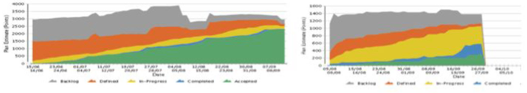 Figure 1 Example Cumulative Flow Diagrams
The diagram on the left shows a relatively smooth Flow of work between the defined states, with work getting accepted at a steady rate from early in the project. The diagram on the right shows little acceptance of work, and a high amount of work in progress.
2.7 Usefulness as a Trailing Indicator
When the “In Progress” queue is wide for long periods its an indication that the people in the team are either working on individual user stories rather than collectively working on a smaller number of user stories. It can also be an indicator that the team is encountering impediments that prevent closing user stories. You can tell if a particular type of work is building up. You can tell if a particular group, e.g., QA or UE, is overloaded. You can tell if a particular person or group is disengaged for any reason, e.g. the PO if work is slow to get accepted. You can tell if effective backlog grooming is happening. In general, the CFD shows a history of how well a team’s process is working for them.
2.8 Usefulness as a Leading Indicator
At a team or program level the CFD can be used to forecast the probability of (a) delivering a desired set of content by a given date, or (b) the date by which a subset of the content might be delivered. Figure 2 shows how we can extrapolate the likely delivery window of the release backlog content based on the acceptance rate to date and the current size of the backlog.
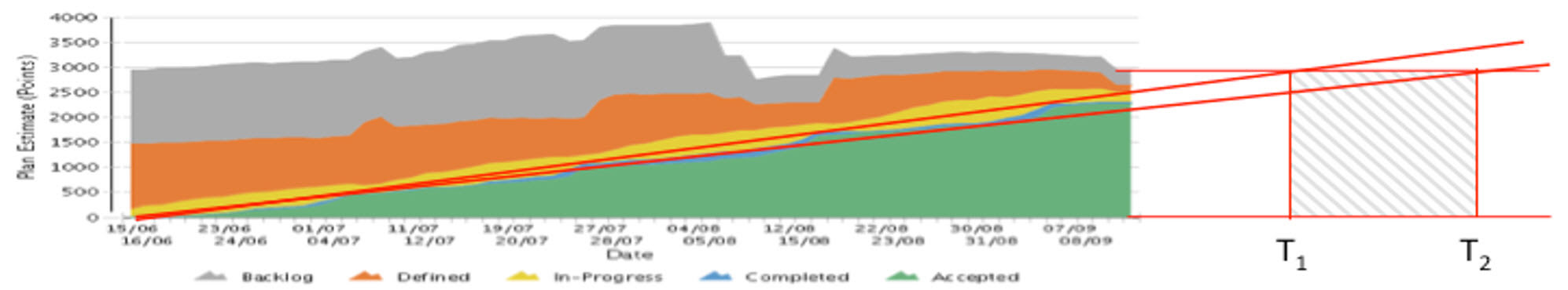 Figure 2 Using CFDs to predict likely completion window for content
In this example, based on the rate of acceptance so far, we can see that the current backlog content will likely be complete between dates T1 and T2. These indicators give pointers for deeper conversation and analysis.
2.9 Shortcomings of this Metric
Resist the temptation to make value judgments based on CFD. There is a danger that the metric can be misapplied, and used as a justification to interfere with, or “inflict help” upon a team. It is important the metrics are used for generating insight and having a conversation, not for coming to premature judgments. The teams need the opportunity to learn. Also, it does not provide visibility on specific features or user stories. It is possible to perform a CFD analysis on features and user stories, and some tools provide that support, but we find that this is usually not necessary. We are more interested in the macro level.
3. Throughput Analysis with Demand Analysis
A Throughput Analysis reveals the rate of the flow of work through the system over time. Combined with Demand Analysis, it shows how much work is Value Demand vs. Failure Demand (Power and Conboy, 2014).
3.1 Context
We have teams who are busy doing lots of work, yet not consistently delivering value. They were not effectively reflecting on why. False optimism compelled them to continue to commit to more user stories than they could deliver. Although they were always busy, it was not clearly visible what type of work was consuming their time.. The team was frustrated. Management was frustrated.
3.2 Problem and Impact
It is not always clear what specific value the work is adding. Compounding this, managers focus on capacity utilization, i.e., making sure that everyone on the team is busy. Work in progress was typically high. There was a pressure to “show progress” which in turn lead to all user stories being in progress for the duration of the Sprint, a rush to get them accepted at the end, and invariably, multiple user stories not getting accepted.
Often driven by management pressures, some teams focus on efficiency at the expense of effectiveness. Sometimes teams and managers express frustration that they seem to be busy all the time, yet their velocity is not increasing or the tangible value added to the product each Sprint is not as high as they would expect.
3.3 Countermeasures
Focus on throughput – getting work done – rather than capacity utilization. At a micro level, analyze the throughput of teams. At a macro level analyze the throughput of programs and the organization.
3.4 Action Taken
Throughput analysis is part of the end of Sprint review, and periodic program reviews.
3.5 Resulting Benefit
We can see how much work is flowing through our system over time. This gives us an indication of how much work we are likely to be able to manage in the future. We found further benefit when we started to analyze throughput in terms of Failure Demand and Value Demand. Looking at everything as “work” without any filters was hiding the fact that a significant portion of the work for some teams was Failure Demand. In some cases, Failure Demand dominated the work. On the surface, it was clear that everyone was busy doing work that was necessary. Looking beneath the surface revealed that a lot of that work was avoidable. This, in turn, lead to some organization-wide retrospectives to understand why this was happening.
3.6 Example
Figure 3 shows two examples of Throughput Analysis. The vertical axis represents the number of work items (not points), the horizontal axis represents months (not Sprints). Figure 3 (a) shows a “plain” Throughput Analysis” with no distinction between the types of work. Figure 3 (b) shows a Demand Analysis overlaid on the Throughput Analysis. This reveals that Failure Demand dominates this team’s work for several months.
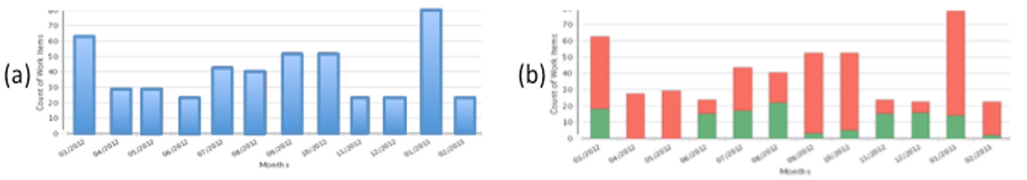 Figure 3 Throughput analysis with and without Demand Analysis
3.7 Usefulness as a Trailing Indicator
A Throughput Analysis shows us how work much work is moving through our teams and organizations. Even better, when combined with a Demand Analysis, it shows us what type of demand is being placed on our teams.
3.8 Usefulness as a Leading Indicator
Throughput Analysis trends provide an indicator of where the demand will be in the near future.
3.9 Shortcomings of this Metric
Throughput analysis does not tell you the reasons why particular demands are impacting your system. It does not show the level of completeness of features, or tell us when a product is ready to ship. Tracking number of work items does not reveal if some are exceptionally small or large.
4. Cycle Time
Cycle Time shows how long individual work items spend in specific workflow states. We measure Cycle Time in days. We use it to understand how work flows through individual states (e.g., In Progress) or combinations of states (e.g., from Ready to Deployed).
4.1 Context
Our teams have a number of defined workflow states. The specific states can vary, but some typical examples are mentioned in section 1.2 above.
4.2 Problem and Impact
We could feel the effects of impediments such as delays, handovers and too much work in progress. Individuals owned their own user stories and other work items, and there was little sharing of work. Managers took an active role in assigning work items to individuals.
Teams were not operating as autonomous, self-organizing teams. There were far more work items in progress at any given time than there were people on the team. This all lead to work in progress remaining high right throughout the Sprint. Whether a given user story would be Done and accepted at the end of a Sprint was unclear. A number of user stories would not be Done by the end of the Sprint. This lead to all sorts of discussion on what to do with incomplete user stories, and some teams developed complex policies around managing incomplete user stories. They were not tacking the root causes of the problem. They had no visibility into the progress of work items between given states.
4.3 Countermeasures
We want to be able to understand how long it takes for work to move through specific workflow states, so that we can answer questions like “how long has this work item been in progress?”. Teams also want to be able to understand the different categories of work, and be able to provide a type of service level agreement for the different categories of work.
4.4 Action Taken
We measure Cycle Times for individual work items in different state. Tools support automatically measuring Cycle Time, and it is also important to visualize Cycle Time on the work items in the team’s Kanban or Scrum board. At a minimum, we want to see the date that a work item entered a given state. It is also useful and intuitive to track duration using “prisoner metrics”. Make Cycle Time reports visible beside the team’s board.
4.5 Resulting Benefit
Visualizing the Cycle Time of individual work items makes it explicit how long a work item has been in progress. There is a definite psychological effect to having that information highlighted. In the most effective cases, teams include a focus on Cycle Time in their daily standup discussions. Teams have actively moved to limit their Work in Progress and collaborate together on user stories.
4.6 Example
Figure 4 shows two example Cycle Time charts that show cycle time trends and averages over time.
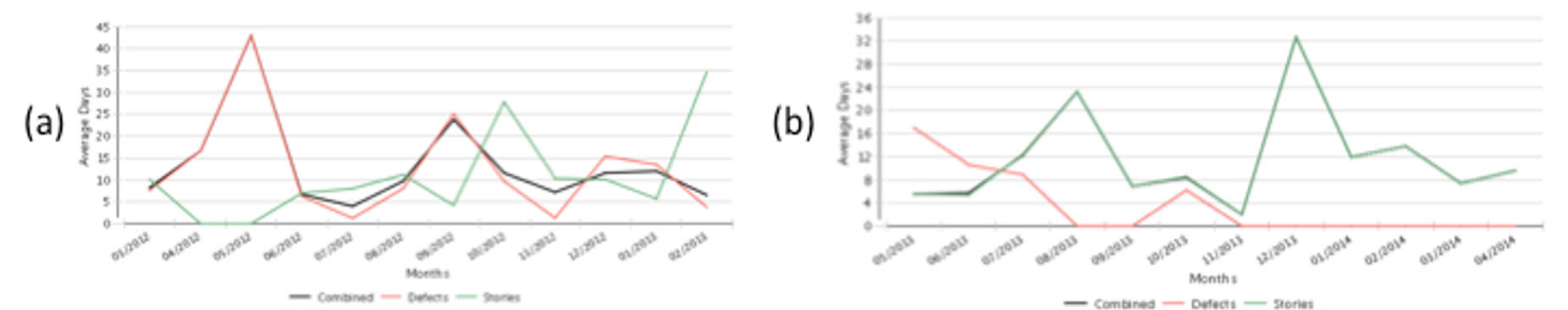 Figure 4. Example Cycle Time Charts
4.7 Usefulness as a Trailing Indicator
A Cycle Time analysis of historical trend data shows where work items are getting stuck. This is a good indicator of the presence of impediments.
4.8 Usefulness as a Leading Indicator
Cycle time can be used to predict likely duration of similar work items, within a range of possibilities. This can be useful in coordinating work across dependencies, e.g., when Team A needs to know when Team B will be Done so they can consume the work of Team A. It can also be helpful in providing service level responses.
4.9 Shortcomings of this Metric
It is possible to reduce Cycle Time in the near term by taking short cuts, e.g., having a weak Definition of Done. If the overall organization is not in alignment, then reductions in one Cycle Time might have no effect, or worse, a negative impact, on other Cycle Times or overall Lead Time.
5. Lead Time
Lead Time shows how long it takes for individual work items to move through our system, from the moment of request, idea or report, to the moment the item is in the hands of users. We measure Lead Time in days, though because of how we release products, Lead Times can be several months.
5.1 Context
We started to visualize Cycle Times, and to make improvements. However, we still had cases where certain features were taking a long time from the customer’s perspective. An improvement of days, or even weeks, in Cycle Time was not in all cases having an impact on consumer satisfaction or value delivered from programs. Drawing end-to-end Value Stream maps helped visualize individual Cycle Times and overall Lead Time (Poppendieck and Poppendieck, 2003).
5.2 Problem and Impact
While there were definite improvements in terms of Cycle Time reductions, visualizing and optimizing Cycle Time tended to initially focus on the development (including test) work of the teams. Some customers and stakeholders were still unhappy with the overall progress of the program.
It was clear there were delays in other areas of the organization, outside the development teams, that were impeding the flow of value.
5.3 Countermeasures
We decided to measure the overall Lead Time of work items. We started to analyze the overall end-to-end flow of work, from the time it came to life as an idea, request or problem report, through to the time that it was included in a deployed product and actually in the hands of end users.
5.4 Action Taken
We measure Lead Time for specific work items. Many of our teams now use a model of Epic – Feature – User Story, where a feature is something that makes sense as a comprehensive value offering to a customer, and is implemented as user stories. We find it is most useful to track Lead Time at the feature level. Tracking Lead Time at the user story level can get too granular, to the point where there are “user” stories that our user’s don’t care about individually – what they care about is the aggregated value provided by the feature.
Track Lead Times on a program level. It usually takes more than a single Sprint for us to deliver a completed feature. However, we find that, particularly after the first couple of Sprints in a program, features are completed on an asynchronous basis so it is useful to review Lead Times at end-of-Sprint reviews to see what features became complete in that Sprint. Program and portfolio reviews are also an appropriate forum for reviewing Lead Times.
Release retrospectives are a good opportunity to reflect and understand how we can improve Lead Times, and incorporate lessons learned into the next program.
5.5 Resulting Benefit
Lead Times show us the customer’s perspective of how we are delivering value, including features and defect fixes. Where Cycle Times provide a good focus on helping us to identify impediments and improvement opportunities inside the organization, Lead Times give us insight into the customer’s experience.
Lead Time also gives us useful feedback on optimizing Cycle Times. If we optimize Cycle Time, we expect there should be an appreciable positive impact on Lead Time. That was not always the case because, for example, improving the cycle time of one queue can cause bottlenecks in a downstream queue. It is important to learn to pay attention to the subtle interplay between different Cycle Times and overall Lead Time. There is a cost to investing in optimizing a particular Cycle Time. Considering the overall impact on Lead Time is a good way to make trade-off decisions when deciding which Cycle Time reduction to invest in.
5.6 Example
Some tools we use have support for tracking end-to-end Lead Time of Epics and Features, and some teams use them. Others use a simple spreadsheet. Either way, the basic information is the same. We track the request date of Epics and Features (or date of idea, if not a customer request). For defect fixes we track the report date. For both, we track the date at which it makes its way into a released product and into the hands of customers. David Anderson describes how Lead Time can be used to measure Flow efficiency (Anderson, 2010).
5.7 Usefulness as a Trailing Indicator
Historical trends give us a way to understand how long it is likely to take to deliver similar features or other types of work items.
5.8 Usefulness as a Leading Indicator
It can be used to indicate the likely duration of the end-to-end flow of work through the system.
5.9 Shortcomings of this Metric
Software teams and organizations are complex additive systems subject to high variation. Lead Time by itself does not help us visualize the causes and impacts of variability.
6. What We Learned
6.1 Advantages
We have experienced the following advantages when using these metrics:
- These metrics provide insights that we don’t get from metrics like burn-down, velocity trend and burn up.
- CFDs show us where work is getting stuck in a queue.
- Throughput Analysis shows how much work is flowing through our system. Applying a Value Demand and Failure Demand analysis to Throughput, we can see how much of that work is delivering real value, and how much work could have been avoided.
- Cycle Time analysis shows us how long it takes individual work items to flow between specific workflow states. It gives us some insights to where we might want to optimize, and it contributes to predictions for work of a similar type moving between the same states.
- Lead Time analysis shows us the end-to-end time for individual work items to flow through our system.
6.2 Challenges
Some resist using these metrics; they challenge their traditional way of viewing progress. For example:
- They want to be able to make statements like “we are 70% done” to illustrate “progress”.
- “Development is done, its stuck in QA.” occurs when there is still an organization divide, and teams are not autonomously operating as cross-functional “teams” or considering end-to-end flow. It also signals that teams do not have a real “Definition of Done”. Using CFDs is a good way to make this challenge transparent.
- “When will we be feature complete” occurs when a team or organization cannot let go of the mindset of a long testing tail. “Feature complete” tends to be an artificial milestone that usually indicates the beginning of a bug fixing or firefighting period.
Not everyone is ready for these metrics, and you can’t force them on a team or group. Some people are open to influence and education on these topics, others are not. Invariably, the ones who do not consider these metrics continue to struggle with their agile adoption and continue to experience impediments and difficulties with their program deliveries. Fire-fighting is common in such teams.
The teams that embrace these concepts and practices invariably experience benefits. They use the insights to make decisions about how they are working. They adopt practices like Pair Programming and Test Driven Development. Teams take more ownership of how they are working. Managers see the benefits, and focus more on creating the conditions for self-organization and autonomy for the teams. Teams intentionally introduce WIP limits and share work. The behavior changes lead to increased productivity and fewer defects. Of course other factors are also at play, but there is a strong correlation between the improvements seen, and the metrics and concepts described in this paper.
6.3 Recommendations
Based on lessons learned, this paper offers the following recommendations:
- Review the metrics at the end of each Sprint or iteration if you are using Scrum and/or XP. Review them at designated planning milestones if you are using Kanban and/or continuous flow.
- Display team charts in each team area beside their Scrum or Kanban board. Update the charts daily. Draw attention to them in daily stand ups.
- If you have a weekly program review, or similar structure, for communication and coordination across stakeholders, make these metrics part of that review.
- Analyze the metrics for insights and indicators, looking for patterns.
- Gain deeper understanding by talking to the team.
- Use the metrics as input to retrospectives and/or problem solving sessions. Take action to improve Flow and remove impediments. Hold a release retrospective to do this at a macro level.
- Use these metrics, and the resulting discussions and actions, to inform organization learning. Use Communities of Practice to come together to focus on organization learning from these metrics.
7. Conclusions
In conclusion, these metrics help you understand Flow in your teams and organizations. In particular:
- CFDs give deeper insight into what’s happening in queues or workflow states, and help diagnose problems.
- Throughput Analysis shows how work is flowing through our system over time. It is even more useful when combined with a Demand Analysis that shows the proportion of work flowing through the system that is Value Demand versus Failure Demand.
- Cycle Time analysis shows how long it takes for work items to pass through one or a subset of workflow states. This enables teams to make predictions about how long it takes to process planned work items.
- Lead Time analysis shows how long it takes for work items to pass through the entire organization. This enables the organization to make predictions about how long it will take to process requests. We generally use Lead Time to understand the time it takes work to pass through all states, from the moment there is a request or idea, to the moment the work is complete and in the hands of customers.
- All these metrics can be used to indicate the presence of impediments to Flow in your system.
The combination of these metrics offers good insight into what’s happening in an organization. They provide insight and visibility on status, and inform forecasting around when specific content might be delivered.
8. Acknowledgements
I acknowledge and thank my manager at Cisco and our team for their support. I also acknowledge the great teams and organizations that I have the privilege to work with at Cisco. Thank you Jutta Eckstein for shepherding me through this paper. This paper would not have come together without your patience, support, guidance, keen insights, questions, and edits: Thanks, Jutta, I couldn’t have done it without you!
REFERENCES
Anderson DJ (2010) Kanban: Successful Evolutionary Change for Your Technology Business. Blue Hole Press, Sequim, Washington.
Poppendieck M and Poppendieck T (2003) Lean Software Development: An Agile Toolkit. Addison-Wesley, Boston.
Power K (2014) Definition of Ready: Experience Report from Teams at Cisco. In Agile Processes in Software Engineering and Extreme Programming, 15th International Conference (XP2014) May 26-30, MMXIV. Cantone G and Marchesi M (eds.), Springer, Rome, Italy.
Power K and Conboy K (2014) Impediments to Flow: Rethinking the Lean Concept of ‘Waste’ in Modern Software Development. In Agile Processes in Software Engineering and Extreme Programming, 15th International Conference (XP2014) May 26-30, MMXIV. Cantone G and Marchesi M (eds.), Springer, Rome, Italy.
Reinertsen DG (2009) The principles of product development flow: second generation lean product development. Celeritas, Redondo Beach.
Sobek DK and Smalley A (2008) Understanding A3 thinking : a critical component of Toyota’s PDCA management system. CRC Press, Boca Raton.